Lifeable Kids Redesign
Reimagining Wellness: A Fun & Friendly Look for a Kids’ Supplement Brand

Packaging Illustration
Academic Project (SCAD)
May 2025
This project focused on redesigning the packaging illustration for Lifeable Kids Calcium Magnesium + Vitamin D3 Gummies. As a academic project, the goal was to create a compelling visual identity that appeals to both children and their caregivers. The final design needed to reflect the product’s playful nature while communicating health benefits in a trustworthy and visually engaging way.
Target Audience
Children aged 2+ and their caregivers
Problem
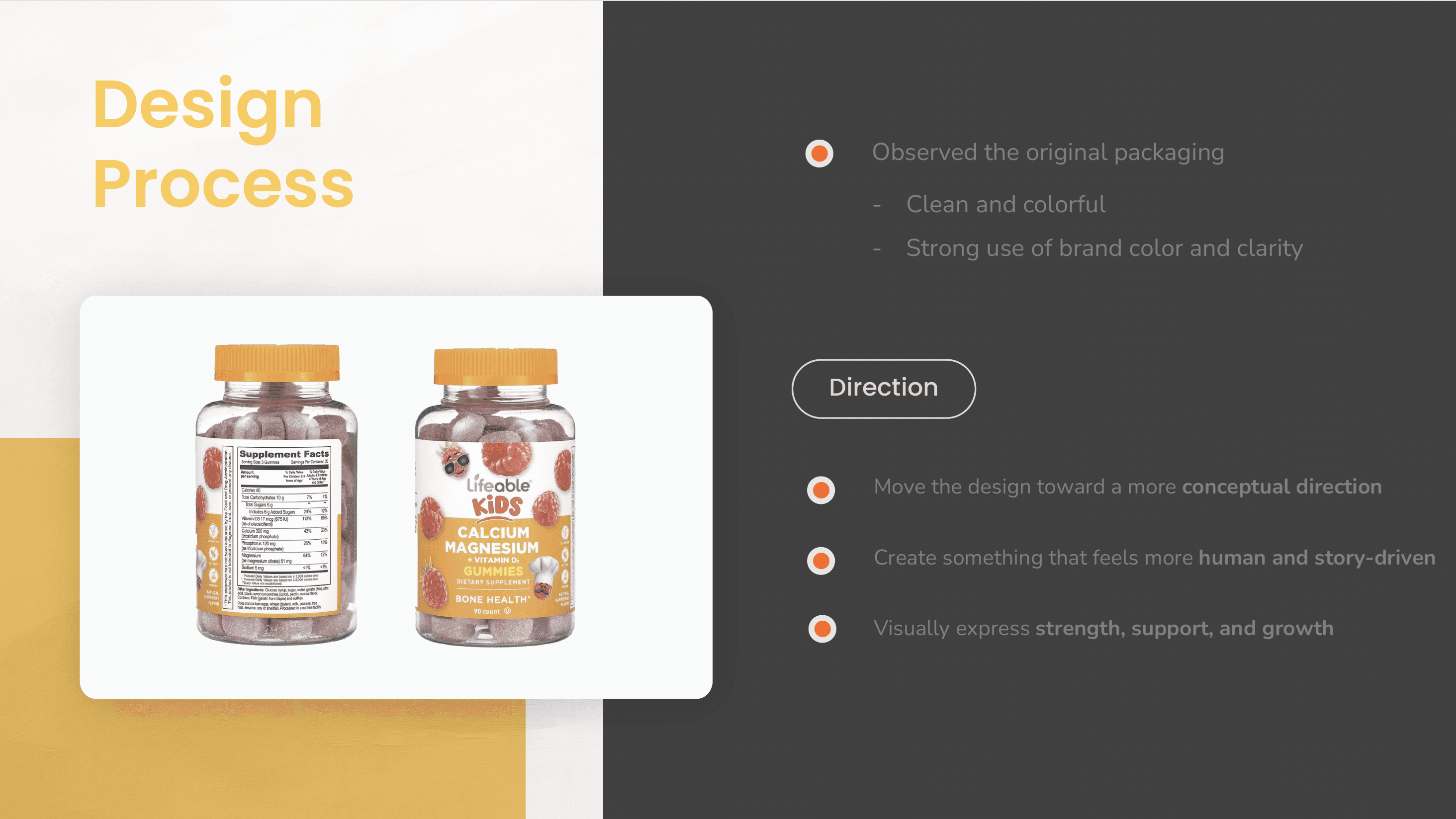
The existing packaging already uses playful raspberry characters to make the product appealing to kids. For this academic project, I wanted to explore an alternative direction that leaned more into illustration and storytelling. The challenge was to blend playfulness with credibility while clearly expressing the product’s health value.
Solution
I designed a new visual world filled with friendly, illustrated whimsical characters that turn healthy habits into adventure. With warm palette with soft edges and gentle contrast, the design feels both joyful and caring inviting trust from parents and delight from children
Process
Research: Explored the brand, target market, and competitors
Concept Development: Created mood boards and thumbnail sketches to explore different directions
Color Exploration: Produced value and color comps to define mood and contrast
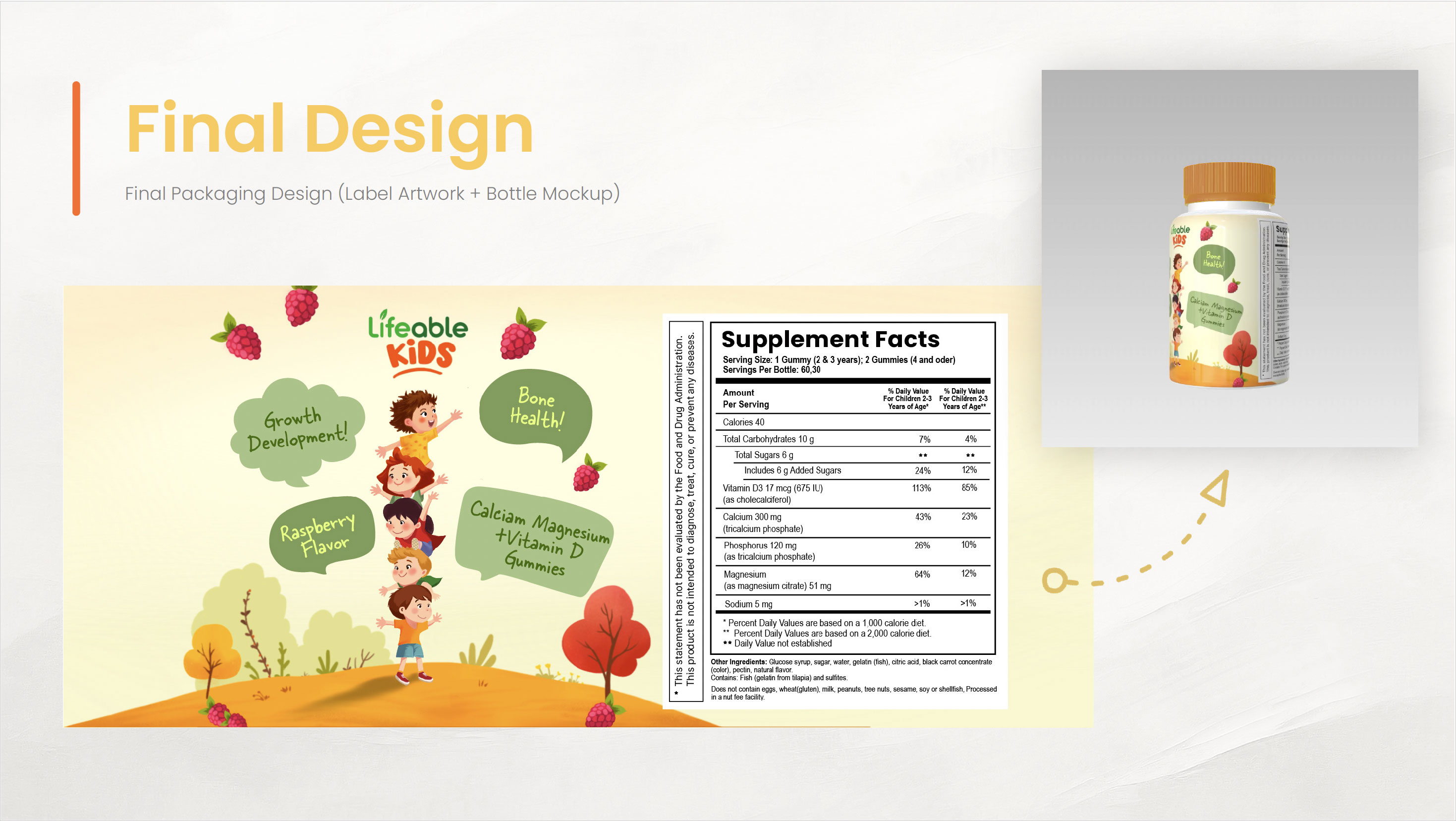
Final Illustration: Designed a wrap-around label (3” x 7”) with a clear front panel, balanced composition, and friendly characters that embody strength and vitality
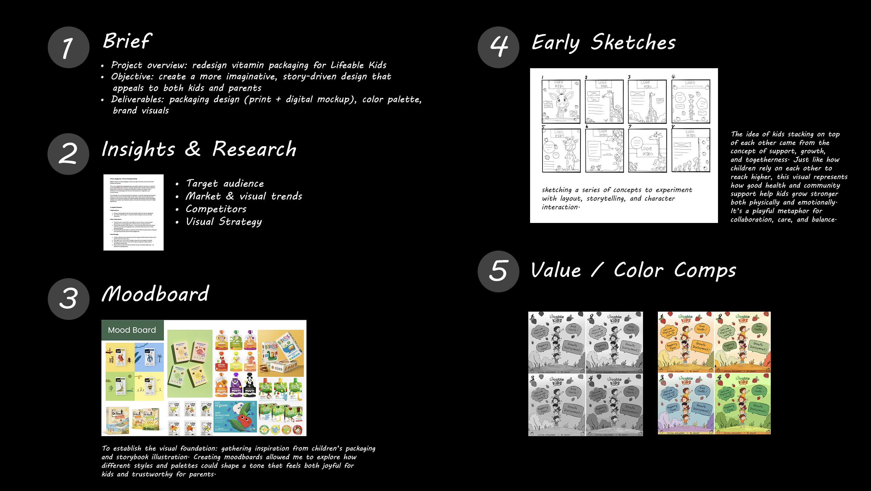
Initial Thumbnail Sketches
I started by loosely sketching different layout ideas and character placements to find a composition that felt playful and full of life.
After several rounds of sketches and layout exploration, I decided to focus on a concept that felt both playful and meaningful. The idea of children stacking on top of each other was inspired by the themes of growth, support, and strength. Each child relies on another to reach higher, symbolizing how health, care, and community form the foundation that helps them grow strong. This vertical composition also visually communicates height and progress echoing both the physical and emotional development that comes from being supported
Value & Color Comps
After finalizing the composition, I explored several color directions to find the right balance between playfulness, warmth, and brand consistency. Since this project builds from the existing Lifeable Kids identity, part of my goal was to maintain a sense of brand familiarity while enhancing emotional warmth through color.
Version 1 (Warm Orange): Captures a cheerful, sunny tone that conveys energy and optimism ideal for kids’ products.
Version 2 (Earthy Green): Feels natural and grounded, aligning with the brand’s health and wellness aspect.
Version 3 (Cool Blue): Suggests calmness and trust but feels slightly distant from the playful tone of the brand.
Version 4 (Fresh Green): Bright and vibrant, balancing fun and health making it a strong fit for the brand personality.
The final color direction blends the warmth of Version 1 with the fresh, healthy energy of Version 4. The warm background and green accents balance fun and credibility—bright and playful for kids, yet natural and trustworthy for parents.
Final Packaging Illustration
Bringing everything together, I refined the characters and environment into a cohesive, polished label design. I paid close attention to balance, color harmony, and detail to make the final piece feel both imaginative and clear. The goal was to create something that looks joyful and engaging while communicating trust and care; the kind of packaging I’d be drawn to if I were a parent shopping for my child.
✦ Procreate ✦ Illustrator
Tags
Illustration, Digital Art, Consumer Goods