The Population Shift
Visualizing 50 Years of Global Change Across Print, Web & Motion

Data Visualization Through Print, Web & Motion
SCAD / Academic Project
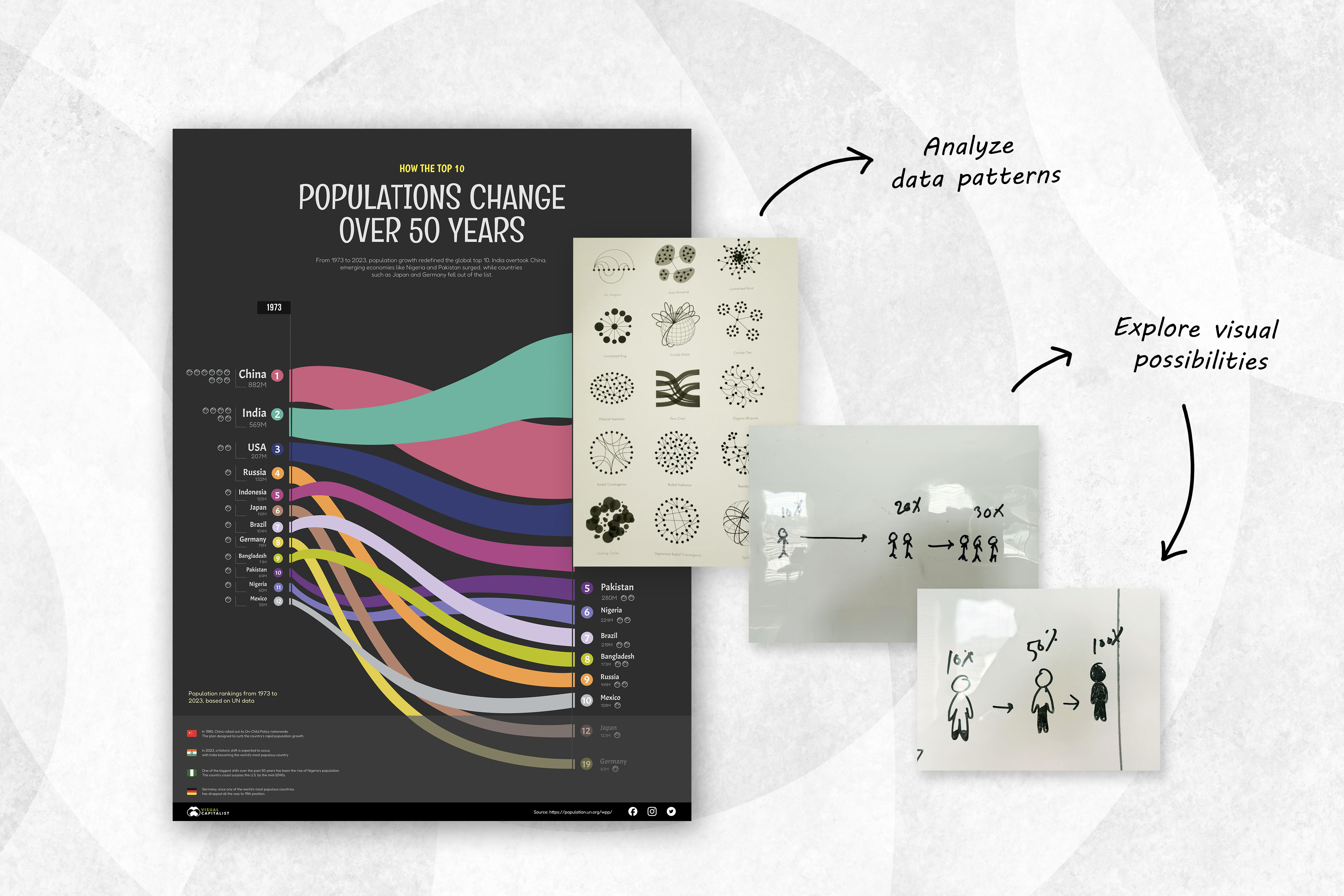
Stage 1: Poster Redesign — Rethinking the Flow of Information
The project began with the goal of reimagining how population data could be visualized across time. I started by studying existing graphics, particularly The World’s Most Populous Countries chart from Visual Capitalist. While informative, I noticed the vertical timeline felt less intuitive for Western readers. Research shows that people often map time in the same direction as their reading habits: left to right, so I decided to redesign the layout horizontally to make it more natural to follow.
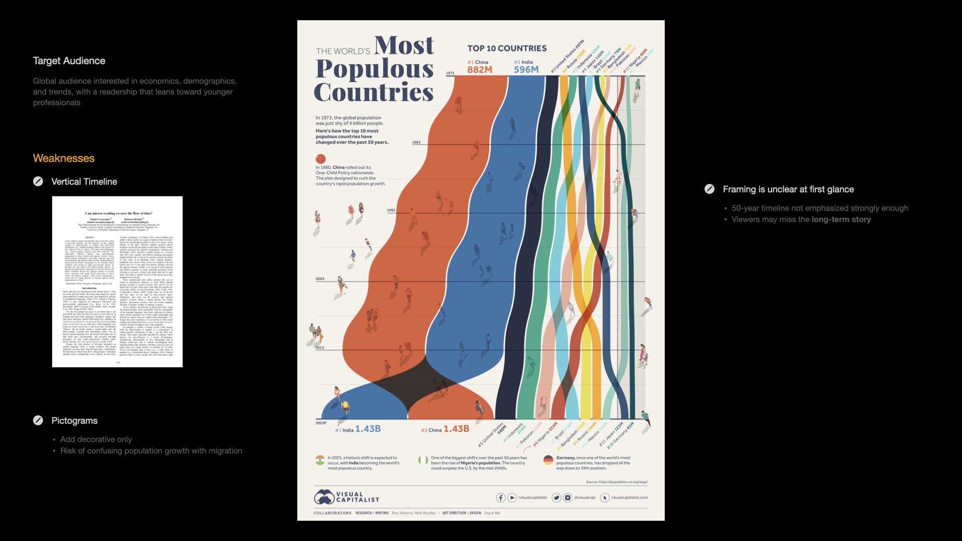
That insight became my starting point. I redesigned the poster horizontally, letting the timeline move from past to present, so viewers could “read through time” as they followed the flow of countries shifting ranks. This simple change made the data feel more narrative and engaging.
Before finalizing the visual direction, I explored different ways to represent growth experimenting with circles, clusters, and figure-based concepts to understand rhythm and proportion. Some early pictogram tests looked appealing but felt misleading, as they could be interpreted as migration rather than population growth. These studies helped me find a visual language that felt both analytical and human.
From there, I refined the data visualization to focus on clarity, rhythm, and smoother transitions that reveal how countries rise and fall over decades. Each hue represents both identity and story, while the shifting ribbon widths subtly express population growth over time. As colors overlap, twist, and separate, the story of global population becomes one of momentum, contrast, and transformation.
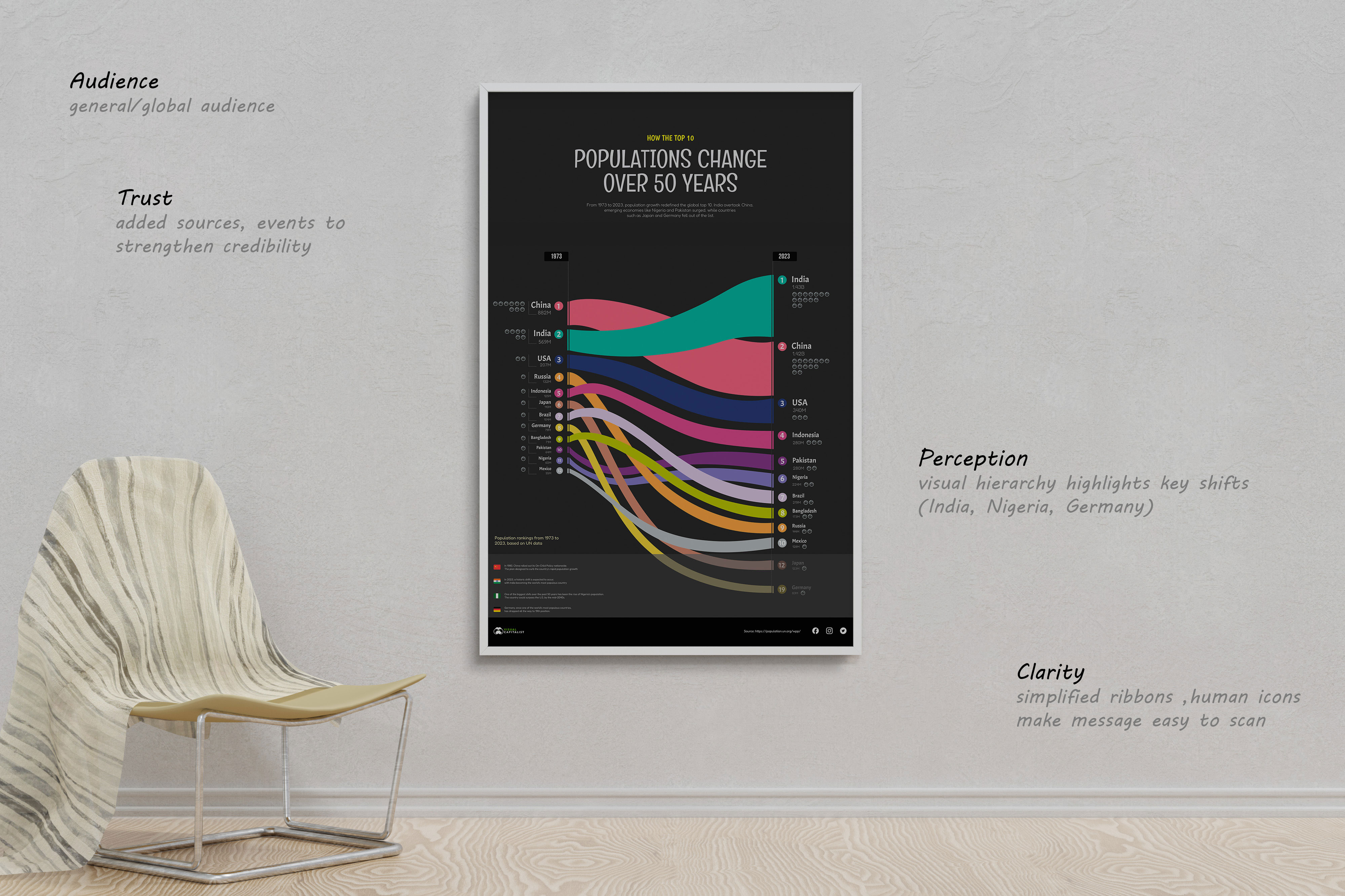
The design aims to make fifty years of population change easier to grasp, not just through data, but through a sense of human connection.
Stage 2: Poster Redesign — Rethinking the Flow of Information
After completing the poster, I wanted to bring the story to life in a more dynamic way…something users could explore and experience at their own pace. For the digital format, I chose a web article graphic, which gave me both space and flexibility to expand the narrative.
I wanted users to scroll through time, hover, and interact with the information making discovery part of the experience. When hovering over a ribbon, key details and incidents expand on the side, showing how population trends connect to real historical moments.
To make the story more personal, I added key events that give social and political context. For example, when hovering over China, users see the note about the 1980 One-Child Policy explaining the country’s slowed growth and eventual drop to second place. Each event acts as a narrative anchor, reminding viewers that data is not just numbers, but the result of human decisions and policies.
Design-wise, I focused on continuity from print to screen. The ribbon form remained the core visual element, but spacing, typography, and color contrast were adjusted for better readability on digital devices.
While the poster was designed to communicate the big story quickly, the digital version focused on deeper exploration. The process taught me that print design pushes for clarity and simplicity, while digital invites layering and discovery. Together, they show how medium shapes not only visual design but also the way audiences interpret data.
Stage 3: Motion — Bringing the Data to Life
After completing the interactive version, I moved into the final stage transforming the story into motion. The goal was to translate population data into a short, cinematic 60-second piece that could both inform and emotionally connect with the audience. My focus was on turning the same data into a visual story that people could actually feel and follow. That guided me the entire process.
Before jumping into animation, I planned everything through a detailed storyboard. Each frame mapped out the scene transitions, narration, and sound effects, so I could see the story flow clearly from start to finish. I also wrote the voice-over script myself shaping the tone to be calm and reflective and added notes for matching sound cues like flips, transitions, and ambient movement.
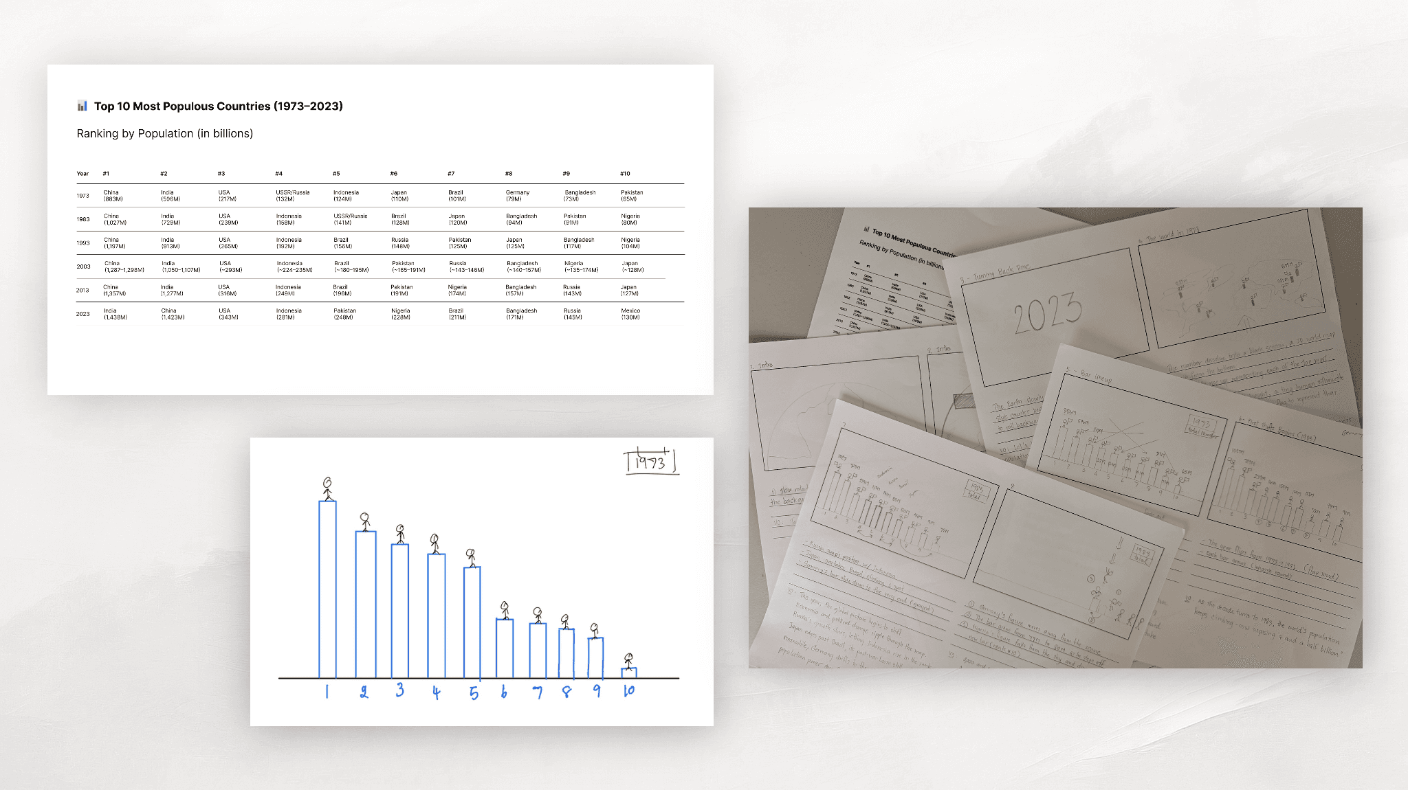
The piece begins by drawing the audience back in time starting with a calm view of the Earth before transitioning to 1973, when the first top ten countries appear on the map. From there, each decade unfolds as population bars grow, shift, or change position. The animation shows how countries rise or fall in rank, while small touches like the flipping year or drifting flag make the transitions more meaningful.
I wanted the motion to stay simple and easy to follow. Every movement had a reason helping the viewer stay focused on what’s changing. When the story reaches 2023, India overtakes China, marking the most significant shift of the century.
The voice-over ties it all together, guiding the viewer through the changes while connecting them to human decisions and history, such as China’s One-Child Policy and its long-term effects. Subtle sound effects keep the piece engaging without overwhelming the visuals.
It ends with a quiet line:
“The story continues. Who will shape the next fifty years?”
It’s a simple ending that leaves the audience thinking reminding them that population growth is not just about numbers, but people and time.
By creating the story across print, web, and motion, I learned how each medium changes the way people experience data. The poster shows the big picture, the web version lets people explore, and the motion piece brings emotion and life to the story.
✦ Illustrator ✦ Photoshop ✦ Figma ✦ After Effects